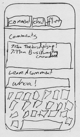
first mockup for comment tab
For usability's sake, web apps tend to use familiar components. There are a number of design templates that make it easy to get a an application up and running without spending a lot of time wrestling with html and css.
One of the problems with using these templates, is that your application will end up looking like every app that uses the same template. At some point I will make the application look more unique, so I've added "not cookie cutter" to the requirements.
Here is my first drawing for the comment component of seatMate. It is basic, but should provide enough to get started. Please pardon my messy drawing!

repo
I've added this mockup and an initial skeleton for the app to the
seatMate github repo.
